


Beverage packaging design is more than the creation of a bottle, can or label. It’s the design of a brand’s first physical relationship with the person holding it. For many brands, the package creates the first emotional connection with a consumer, long before the first sip. Before a drink is tasted, the package has already communicated something about its quality, personality and promise.
At Tether, we don’t separate structure from graphics. The bottle or can and the label placed on it are created together, by the same multidisciplinary team, against the same strategic brief. Every structural move influences the graphics. Every graphic decision reinforces the structure. When they evolve together, the result feels inevitable rather than assembled.
This guide explores that integrated approach, how structure shapes decoration, how decoration strengthens structure, and what that looks like in practice through our work with Gatorade, Popwell and Pepsi. It builds on our guide to CPG packaging design, focusing on the category where industrial design and brand expression become impossible to separate.
Consumers never experience a beverage package in pieces. They don’t evaluate the bottle first and the label second. They experience one object, one interaction, one impression.
That’s why we believe beverage packaging design should be approached as a single creative discipline.
The curve of a shoulder determines where a logo can comfortably live. The depth of a panel decides whether a label sits perfectly or wrinkles over time. A shrink sleeve creates opportunities a pressure-sensitive label never can, but only if the structure was designed with that application in mind from the beginning.
When industrial design and graphics happen independently, each ends up compensating for the other’s compromises. Engineering locks the form before the brand has found its voice. Or artwork is approved first, leaving the structure to simply carry graphics that were never designed for a three-dimensional object.
The strongest beverage brands are built the opposite way.
When bottle design and label design evolve in parallel, each discipline does work for the other. A structural window can replace a printed graphic. A bold shrink sleeve can simplify tooling costs. Custom bottle design and packaging graphics stop competing for attention and begin working together to tell a clearer story.
That philosophy runs through every beverage project we undertake.
Every beverage package is judged before it’s ever read.
The first review happens in someone’s hand.
Before consumers notice typography, color or messaging, they experience grip, balance, weight, comfort and motion. Beverage container design begins with these physical interactions because they’re often what people remember most.
Container design asks deceptively simple questions.
How easily is it picked up?
Can it be opened with one hand?
Does it pour cleanly?
Does it fit comfortably in a car cup holder or refrigerator door?
How does it feel after condensation forms?
The answers influence everything that follows.
A narrower waist changes label proportions. A different cap diameter alters the silhouette. Shelf constraints dictate overall height before the first design sketch is drawn. This is where industrial design and beverage branding begin speaking the same language. And where our sports product design work overlaps most with packaging.
Our work on the Gatorade bottle started exactly here.
Research uncovered problems athletes experienced every day. Loose labels collected condensation and dripped onto courts and locker room floors. The oversized body was difficult to grip with one hand. The wide opening made spills happen during competition.
None of these were graphic design problems.
Every one of them became design opportunities.
That’s why ergonomics become aesthetics in our process. When the experience feels right, the form earns its shape. The graphics simply amplify the job of the form.
When Sparkling Ice approached us to create a prebiotic soda brand, the opportunity extended far beyond designing a package. We were creating an entirely new relationship between consumers and a rapidly growing category.
Our research revealed a familiar pattern. Most functional beverages leaned toward one of two extremes. Some felt clinical, almost pharmaceutical. Others over-indexed on sweetness and buried their health benefits beneath playful branding.
Very few successfully balanced optimism, wellness and everyday enjoyment.
That insight shaped everything.
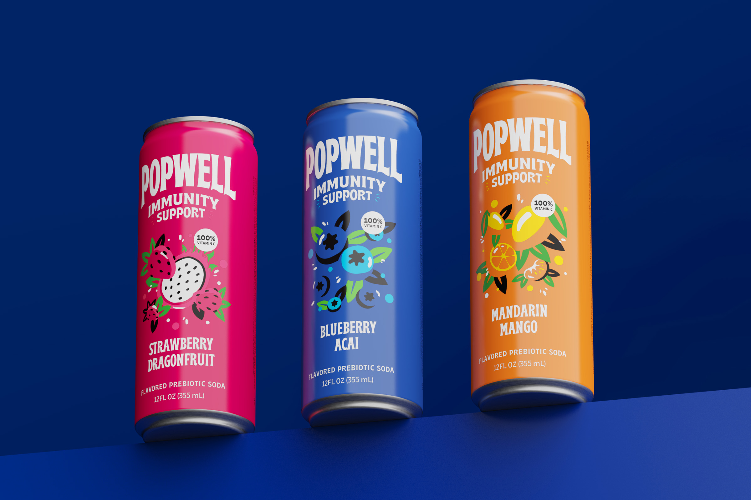
We developed the name Popwell to capture both the joy of soda and the credibility of wellness. Around it we built craveable flavor names, bold benefit messaging, expressive illustrations and a vibrant visual identity designed to stand apart in an increasingly crowded beverage aisle.
Because the package was a can, structure remained intentionally simple.
That made the graphics the architecture.
Every decision, from illustration scale to typography hierarchy and nutritional messaging, worked harder to create shelf presence. Beverage branding and packaging became one integrated system, allowing consumers to understand the brand from six feet away while still discovering new details up close.
The Gatorade bottle redesign remains one of our clearest examples of integrated beverage packaging design because nearly every engineering decision arrived before the creative work began.
The challenge wasn’t simply to redesign an iconic bottle.
It was to make engineering disappear.
PepsiCo and Stress Engineering established clear performance requirements. The new bottle needed to be lighter than its predecessor, stronger under pressure and capable of surviving the hot-fill process. Those constraints required vacuum panels and structural ribs that structurally resist deformation as the product cools.
Our role wasn’t to fight those requirements.
It was to transform them into brand assets.
We established three design principles.
Create an athletic stance with broad shoulders and a tapered waist.
Transform the iconic Gatorade bolt into something structural as well as recognizable.
Consistently use the unmistakable orange cap.

The bolt became a transparent window in the shrink sleeve revealing flavor. The narrower waist improved one-handed grip. A shrink sleeve replaced the condensation-prone wrap label, while a refined opening reduced spills and used less plastic.
The most satisfying work, however, was almost invisible.
Rather than allowing structural ribs and vacuum panels to dominate the bottle, we integrated them into the muscular language of the form itself. Engineering disappeared into athleticism. What consumers experienced as strength and movement was, in reality, carefully disguised manufacturing performance.
The results reflected the success of the entire program.
The redesigned bottle was approximately 13% lighter and 25% stronger, allowing PepsiCo to reduce corrugated shipping materials by nearly half through shrink-wrapped trays. The project earned the DuPont Packaging Award for Responsible Packaging and, despite initially soft launching quietly in only five markets without marketing support, generated substantially stronger purchase rates.
Design solved engineering problems while strengthening the brand. Every design decision, from the bottle’s stance to the transparent bolt, was made to deepen the emotional connection between the Gatorade brand and the athlete holding it.
That’s integrated beverage packaging design.
See our beverage and integrated design work across industrial design and CPG.
Every beverage package eventually meets the factory.
And the factory always gets a vote.
Line speeds, mold costs, fill temperatures, labeling equipment and case-packing systems all shape what’s possible long before a product reaches the shelf. Whether we’re designing a sports drink bottle or developing luxury packaging design (as noted in our guide) for a premium beverage brand, manufacturing isn’t something to solve at the end of the process, it’s part of the creative brief from the very beginning.
The strongest beverage packaging design embraces these realities rather than resisting them.
The Gatorade bottle illustrates this perfectly. Hot-fill manufacturing required vacuum panels and structural ribs to prevent deformation as the product cooled. Instead of treating those features as engineering compromises, we designed them into the athletic language of the bottle itself. The engineering became invisible because it was fully integrated into the brand expression.
The same principle applies to countless smaller decisions.
A shrink sleeve accommodates compound curves that a traditional pressure-sensitive label simply cannot, opening new possibilities for structural design while introducing different manufacturing considerations. A narrower opening uses less plastic, reducing both environmental impact and material costs. Wall thickness, base geometry and tooling choices may seem like technical details, but at production scale, every fraction of a gram and every second on the production line matters.
Those decisions don’t simply affect manufacturing.
They shape the business.
Scale amplifies every design choice.
When we partnered with PepsiCo on its Pepsi brand and packaging refresh, we weren’t designing for a single manufacturing facility. The new bottle forms needed to work across a global network of bottlers, each with different equipment, capabilities and production realities.
Working alongside PepsiCo’s R&D team, we developed a modular design system rather than a single bottle. Shared design principles allowed the visual language to extend across the broader PepsiCo portfolio while reducing development costs and simplifying future innovation.
At that scale, you’re no longer designing one package.
You’re designing the rules that hundreds of packages, and millions of products, will follow.
We don’t see manufacturing constraints as the enemy of creativity.
More often than not, they’re where the most enduring ideas begin.
Choosing a beverage packaging design partner isn’t simply about finding a team that can create a compelling bottle or eye-catching graphics.
It’s about finding a partner who understands that every decision; structural, visual, technical and strategic, contributes to the same brand story.
As you evaluate potential partners, here are five questions worth asking.
1. Who owns the whole package?
Consumers experience one object, not separate disciplines.
If industrial design lives with one agency and graphics with another, someone has to bridge the gap, and that responsibility usually falls on the client. Look for a partner who develops structure, identity and packaging as one integrated system.
2. How do they approach engineering constraints?
Every beverage program comes with requirements that cannot be negotiated: fill processes, weight targets, manufacturing equipment and regulatory standards.
The right partner won’t treat those realities as obstacles. They’ll demonstrate how engineering requirements became opportunities to strengthen the design rather than compromise it.
3. How early do they think about manufacturing?
Manufacturing expertise doesn’t appear during production, it shapes the earliest sketches.
A team that asks about your co-packer, labeling method, filling process and distribution requirements from the first conversation is far more likely to deliver a design that moves smoothly from concept to production.
4. Can they explain the human problem they solved?
Beautiful packaging is easy to photograph. Meaningful packaging solves problems. When done right, both can happen.
Ask what consumers were struggling with before the redesign. Was the bottle difficult to grip? Did the label wrinkle? Was the product disappearing on shelf? The strongest work begins with understanding people, not aesthetics.
5. Do they connect the brand to the object?
A bottle should never feel like a container waiting for graphics.
The name, the visual identity, the structure and the user experience should all reinforce one another. If your design partner can only speak confidently about one of those disciplines, the others will inevitably become someone else’s responsibility.
The best beverage packaging design doesn’t happen through handoffs.
It happens through integration.
Ready to discuss your next beverage packaging project? We’d love to help you build a brand people can hold in their hands.
Ready to talk through a project? Discuss your beverage packaging project with us.
Every beverage brand gets one first impression on the shelf.
Then it gets another in someone’s hand.
The package carries both.
Long before a consumer tastes what’s inside, they’ve already formed opinions about quality, performance, craftsmanship and trust based on what they’re holding. The package isn’t simply protecting the product. It’s often the first handshake between a brand and the person who will decide whether to trust it.
That’s why we believe beverage packaging design is about far more than creating a bottle or applying a label.
It’s about designing a complete experience. Our goal is to create structures that build emotional connection before the first sip, where engineering, ergonomics and brand expression all work together to tell the same story.
When structure and graphics evolve together, engineering disappears into the form. Every material choice serves both performance and perception. The graphics communicate only what the structure cannot. Every interaction, from the first glance across the aisle to the final sip, feels intentional.
The result is more than a well-designed package.
It’s a physical expression of the brand itself.
For many consumers, it will be the most frequent and most tangible interaction they’ll ever have with your brand. That’s why we approach beverage packaging design as the integration of strategy, industrial design, engineering and storytelling, not as separate disciplines, but as one connected experience.
That’s the standard we hold ourselves to.
And it’s the standard every beverage brand should expect from its design partner.
Share » the » story


