


Luxury packaging design begins long before a consumer experiences the product itself. It is the art of transforming a brand’s story, values, and ambition into something tangible, an object that communicates meaning, quality, and desirability in a single touch. At its best, luxury packaging design turns a product into an experience and a package into an important chapter of a brand story.
At Tether, we design across branding and industrial design within beauty and CPG, giving us a unique perspective on what makes packaging feel genuinely premium. Whether the product lives on a prestige skincare shelf, in a specialty retailer, or in a grocery aisle, the principles remain remarkably consistent. What changes is how those principles are expressed through the lens of the category, the consumer, and the brand’s unique narrative.
This guide explores the fundamentals of luxury packaging design through three very different examples: a from-inception prestige beauty brand, a heritage-inspired beauty success story, and a global beverage icon reimagined at massive scale.
Premium packaging design is often misunderstood as a collection of expensive materials or decorative finishes. In reality, luxury is communicated through intentionality.
Consumers may not consciously notice every decision a designer makes, but they feel the cumulative effect immediately. Weight. Texture. Sound. Proportion. The way a closure engages. The way a package rests in the hand. Luxury is rarely communicated through a single element. It emerges from the harmony of many.
High-end packaging design begins with a clear understanding of the brand’s story. Every decision should reinforce what the brand stands for and why it matters.
That clarity reveals itself in countless details: how a vessel feels when picked up, how graphics interact with form, how an unboxing experience unfolds, and how the package lives in someone’s daily routine. These moments are not accidental. They are carefully considered opportunities to strengthen the emotional connection between brand and consumer.
At Tether, we view brand strategy and packaging design as a single creative challenge rather than separate disciplines. Story informs structure. Structure informs experience. Experience reinforces story. When those elements align, packaging feels less like something that was designed and more like something that could never have been any other way.
Luxury brand packaging is built upon three interconnected elements: material, structure, and finish. When these three work together, packaging becomes far more than a container. It becomes a brand experience.
Material is the foundation of premium packaging design. Before a consumer reads a word, material communicates something about the brand. Heavy glass suggests permanence and value. Textured papers signal craftsmanship. Precision-molded plastics can express innovation and modernity.
The material choice must align with both the brand story and the product experience. A disconnect between material and message is one of the fastest ways to undermine a luxury positioning. The best material decisions feel authentic to the brand rather than impressive for their own sake.
Structure defines how consumers interact with the package over time. It encompasses everything from ergonomics and proportions to closure systems and dispensing mechanisms. Great structure often goes unnoticed because it feels intuitive. Consumers aren’t thinking about how to open the package or use the product. They’re simply enjoying the experience.
That sense of effortlessness is carefully engineered. In luxury packaging design, structure often becomes one of the most powerful expressions of brand identity because it shapes the consumer’s relationship with the product every single day.
Finish is where the details come to life. Matte coatings, soft-touch textures, embossing, debossing, foil stamping, metallization, and color all contribute to the emotional perception of the product.
Consumers often notice finish first, but achieving it requires some of the most rigorous collaboration behind the scenes. Every finish must survive manufacturing realities while preserving the original design intent.
At Tether, we treat material, structure, and finish as a single system. Each decision influences the next. A material may unlock new structural possibilities. A structural innovation may suggest a different finishing approach. The most compelling luxury packaging emerges when all three evolve together.
In luxury beauty, packaging often becomes the primary expression of the brand itself. Consumers don’t learn about the brand through advertising alone. They learn about it through what they hold in their hands.
Tatcha is a powerful example of this principle. The challenge was not simply to create beautiful skincare packaging. It was to translate the essence of ancient Japan into a modern luxury experience through form, color, texture, and interaction.
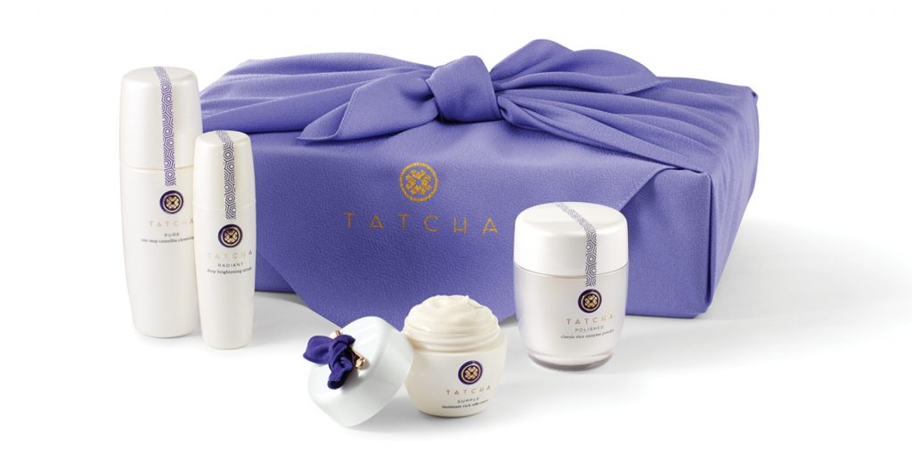
That is a highly emotional brief. It requires packaging to carry cultural meaning. Every element of the Tatcha system was designed to express the balance between ancient wisdom and modern beauty. The package needed to feel authentic without becoming nostalgic, contemporary without becoming generic.
The result is packaging that tells the brand’s story before a single product claim is read. When packaging succeeds at this level, it does more than hold a product. It carries culture, history, and emotion. It becomes the brand’s voice made physical.
One of the most effective ways to move a brand up-market is through authentic storytelling expressed consistently through design. Beekman 1802 demonstrates how packaging can elevate perception while staying true to a brand’s roots.
The brand originated around a philosophy of simple things done exceptionally well. As it evolved into beauty, bath, and skincare, the challenge became creating a visual identity that felt premium without abandoning its authenticity.
The solution was not to imitate luxury. Instead, we amplified what made the brand distinctive. The packaging’s soft, milky translucence references goat milk, the brand’s signature ingredient, before a consumer reads a single word. The material becomes the story.
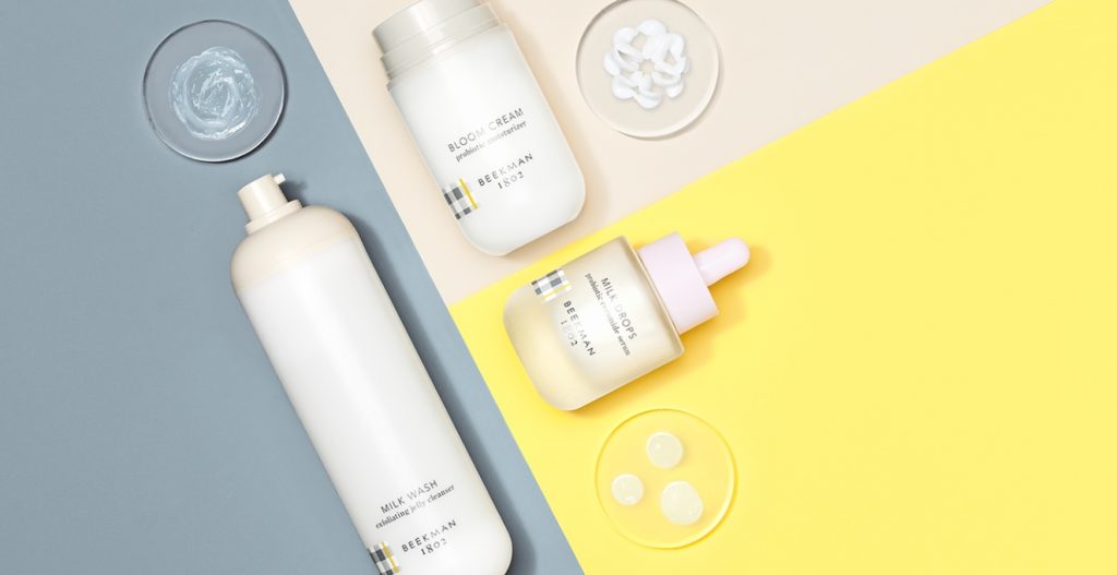
This is what allows Beekman 1802 to stand confidently beside established luxury brands. It doesn’t borrow their language. It speaks its own language clearly and consistently. The most successful premium packaging design doesn’t manufacture credibility. It reveals what was already true about the brand.
Luxury isn’t limited to prestige categories. A mass-market brand can feel elevated when every touchpoint is working from the same story. Pepsi’s global brand and packaging refresh demonstrates how thoughtful design architecture can create a more intentional, premium experience at enormous scale.
The brief was to capture the excitement of NOW by transforming Pepsi from a product logo into a dynamic brand system capable of showing up consistently across markets, channels, and cultural moments around the world.
Rather than creating a rigid set of rules, we developed a framework built around what we call strategic variance: a design system flexible enough to respond to local culture while remaining unmistakably Pepsi. From Saudi Arabia to China and beyond, the identity could adapt to its environment without losing its core personality.
Starting with the energy and equity already embedded within the Pepsi globe, we expanded the visual language into a broader brand ecosystem. The globe became more expressive. The system became more dynamic. The identity could transform itself repeatedly while remaining recognizably Pepsi.
That same philosophy extended into structural packaging design. Drawing inspiration from archival Pepsi wave elements, we evolved both the glass and PET bottle families into sculptural, swirling forms that feel simultaneously contemporary and familiar. Although the bottle could stand alone, it was designed as a physical expression of a larger brand story.
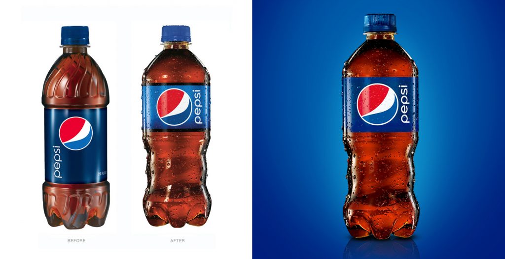
Designing for a global bottling network required more than creativity; it required discipline. Working closely with PepsiCo Research & Development, we established design guardrails that could scale across the portfolio while reducing complexity and creating efficiencies for future innovation.
To align senior leadership, we designed a series of private global pop-up exhibits featuring immersive audio, video, and lighting installations, bringing the future Pepsi experience to life before a single package reached shelf.
The results confirmed the approach: a Red Dot Design Award for packaging, adoption of the new bottle forms across the PepsiCo bottling network, and the launch of the boldest expression of the new design system in Mexico. This is premium packaging design operating as brand architecture, proving that scale and elevated design are not mutually exclusive.
Creating a premium experience does not require the budget of a global brand. It requires clarity. The most successful emerging brands understand where to invest and where to simplify.
Start by identifying the single moment that matters most in the consumer experience. It may be the closure. It may be the primary container. It may be the unboxing experience. Focus resources there.
Consumers remember standout moments more than they remember dozens of average ones. Material selection is often a better investment than decorative embellishment. A beautiful substrate paired with a restrained finish will almost always feel more sophisticated than an inexpensive material covered with effects. Restraint communicates confidence.
Consistency is equally important. A unified visual and structural language across products creates the perception of a larger, more established brand. Even a small portfolio can feel significant when every SKU feels connected to a larger system.
The goal is not decoration. The goal is coherence. Brands that embrace system thinking early create packaging platforms that support growth for years to come.
Before a product is experienced, packaging has already started the conversation. The most effective luxury packaging design does more than attract attention. It creates belief. It signals quality, communicates values, and gives consumers a tangible expression of what the brand stands for.
Whether we are designing for prestige beauty, premium CPG, or global consumer brands, the principle remains the same: every detail should tell the same story. At Tether, we believe packaging is one of the most powerful storytelling tools a brand possesses. When material, structure, finish, and narrative align, something remarkable happens.
The package no longer feels designed. It feels inevitable. And that feeling is what consumers remember.
Share » the » story


