


Skincare packaging design is where brand, formula, and form become one experience. At its best, it protects the integrity of a formula, dispenses it beautifully, and communicates a brand’s promise before a consumer ever opens the cap. In the luxury beauty category, packaging carries an additional responsibility: it must feel like the product itself is worth the price.
At Tether, we see skincare packaging design as a complete system. Brand story, structural design, materials, manufacturing, and user experience all work together to create a single impression. The strongest packaging never feels assembled. It feels inevitable.
Design, brand, manufacturing, and real-world use are treated as one challenge, not separate steps handed off between teams. These are the fundamentals of luxury packaging design, applied to the specific demands of skincare.
Long before a consumer tests a formula, the package communicates its value. The weight of a jar, the resistance of a cap, the temperature of the material against the fingertips, these signals arrive instantly and shape expectations for everything that follows. This is the psychology of prestige skincare packaging. The physical object begins the relationship between brand and buyer.
When we design for this category, we focus on sensory feedback at every touchpoint. A heavy glass base implies substance and permanence. A matte soft-touch finish suggests refinement and modern restraint, while a high-gloss lacquer can communicate clinical efficacy or traditional opulence. The sound a cap makes when it clicks into place is never accidental. It is an engineered detail that reassures the user the product is sealed, secure, and thoughtfully made.
These cues only matter when applied to specific categories. In the serum space, dropper resistance and glass clarity can signal potency and purity. For rich night creams, the wide-mouth jar must feel substantial enough to justify a premium price point, often using thick-walled acrylics or double-walled glass that adds perceived heft without proportionally increasing cost. In the cleanser category, the squeeze and recovery rate of a tube communicates freshness and daily utility.
The package is often the first physical interaction a consumer has with a brand. It should deliver on the promise made by the marketing, the formula, and the price tag.
In skincare bottle design, the material choice is never just an aesthetic decision. It determines how the formula is protected, how the product feels in the hand, how it moves through production, and how convincingly the brand can keep its promise at scale.
Glass remains the standard for luxury because of its weight, chemical inertness, and tactile quality. It feels cool to the touch, reinforcing perceptions of premium craftsmanship. Glass is also infinitely recyclable and does not leach into formulas over time.
However, glass presents real manufacturing challenges. It is heavier to ship, more fragile on filling lines, and requires precise tolerances when paired with plastic closures. Mold costs are significant, and minimum order quantities are often higher for custom forms.
When formulas are highly sensitive to light or oxygen, as with Vitamin C serums, retinol treatments, and peptide concentrates, we often specify airless pump systems. An airless pump uses a vacuum mechanism or rising-disc piston to dispense product without introducing air into the reservoir. This helps protect active ingredients from oxidation and allows for near-total product evacuation, reducing waste.
The challenge is ensuring the experience feels smooth and substantial in the hand. Luxury is often judged in moments measured in fractions of a second. Actuator force, stroke length, and dosage per pump must all be calibrated to match the formula’s viscosity and the expectations of the user.
Across the category, cosmetic packaging trends increasingly focus on sustainability without sacrificing a premium experience. We evaluate materials based on both performance and end-of-life considerations. This may mean designing for recyclability through mono-material construction, where an entire package is made from a single resin such as PET or PP, making it easier to process within existing recycling systems.
Refillable systems offer another path forward. The outer housing becomes a permanent object the consumer keeps while only the inner cartridge is replaced.
The goal is not simply sustainability. It is creating packaging that feels desirable enough to keep while being responsible enough to justify its place in the world.
Secondary packaging is the bridge between the retail shelf and the bathroom counter. It is the box, insert, tissue, and structure that holds the primary container. While the primary bottle or jar is the object consumers live with daily, secondary packaging creates the unboxing experience.
It is the brand’s opportunity to tell a story before the product is even revealed.
Anticipation is part of the product.
We design secondary packaging to build anticipation. The friction of a two-piece rigid box sliding apart, the texture of uncoated paper stock beneath the fingertips, and the reveal of a carefully nested product all contribute to the perception of value.
This is where craft and storytelling intersect most directly.
The materials chosen for the outer carton should foreshadow the experience of the product itself. A brand built around natural ingredients may use unbleached kraft paper and vegetable-based inks. A clinically positioned brand may lean into stark white rigid boxes, restrained typography, and magnetic closures.
Secondary packaging also serves practical functions. It protects the primary container during shipping and retail handling. It houses regulatory information, ingredient lists, and instructions that would clutter the primary package. And it creates the moment consumers choose to photograph and share, a moment earned through deliberate design decisions rather than chance.
Our approach to skincare packaging design is best understood through the work itself. These projects demonstrate how structural design, material choices, and graphic identity come together to create packaging systems where every element works as one.
Tatcha launched with a single product: authentic Japanese aburatorigami facial blotting papers. That first package established an “ancient meets modern” design language that would define the brand for years to come.
As Tatcha expanded into a complete skincare line, the challenge was clear: translate the essence of ancient Japan into the modern world through packaging forms, colors, materials, textures, and user experience.
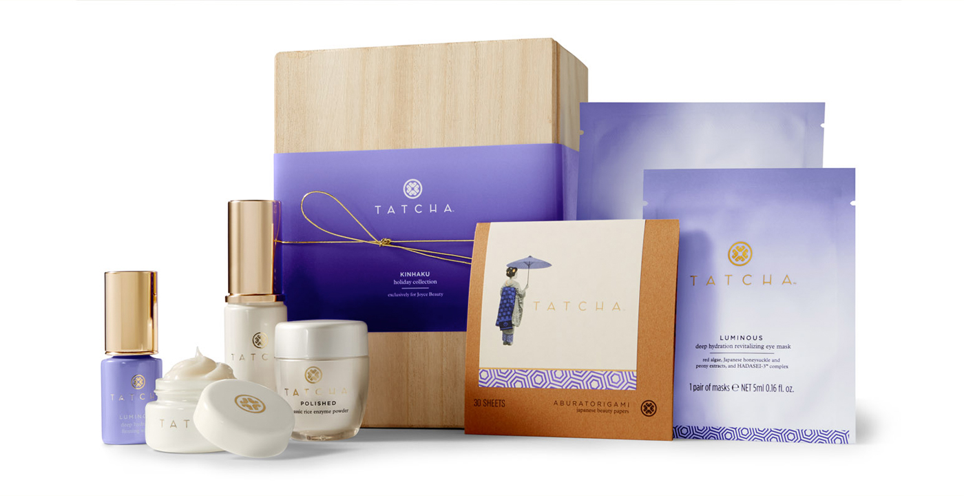
We designed the forms, materials, and graphic language across multiple collections as one coherent system. The packaging forms echo traditional Japanese natsume containers, grounding modern products in centuries of craft tradition.
Each collection needed to feel distinct while remaining unmistakably part of the same family.
By treating the brand as a living system rather than a collection of individual products, we created a packaging language capable of growing alongside the business. The forms, finishes, and graphic language reinforce one another to create a recognizable identity at every scale.
The result was a system that could stretch from a single hero product into a recognizable luxury skincare world.
Beekman 1802 had more than 500 product types built around an ethos of simple things done exceptionally well and treating everyone like a neighbor.
When the brand shifted its focus toward the highly competitive beauty, bath, and skincare categories, it needed a visual rebirth that remained authentic to its roots while competing credibly against established luxury players.
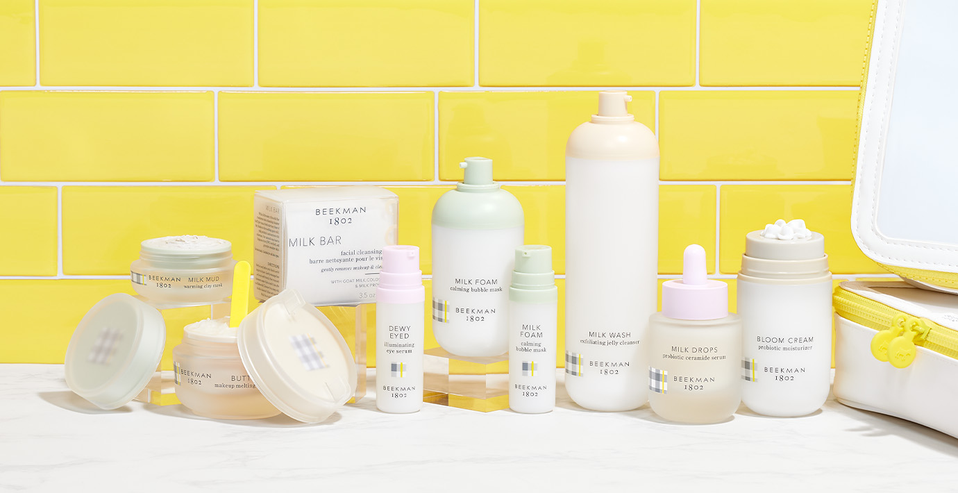
The design philosophy centered on modern simplicity and pastoral elegance. The color palette was drawn directly from life on the Beekman farm: hen eggs, gardens, and the design featured a classic American gingham pattern.
The packaging system became a way to translate the brand’s origin story into a more elevated beauty context. Soft forms, gentle colors, gingham details, and milky translucence helped connect the product experience back to goat milk, the brand’s signature skincare ingredient, while giving the line a cleaner, more competitive presence in skincare and body care.
The package does not simply contain the product. It helps explain why it matters. That connection between appearance, ingredient, and story is the kind of detail that builds desire, and trust over time.
View the Beekman 1802 case study.
View Our Beauty Packaging Portfolio
The best packaging projects begin with clarity. The more context an agency receives at the outset, the more strategic and effective the final solution becomes.
When engaging a beauty packaging agency for a skincare line, we recommend including the following:
State exactly what the product is and its chemical sensitivities. Does it require UV protection? Is it highly viscous or thin and watery? Must it be protected from oxygen exposure?
The formula dictates functional requirements before aesthetic decisions are made.
Be transparent about packaging budgets.
Knowing target COGS early allows the agency to recommend materials and manufacturing approaches that align with projected volumes. A custom glass bottle with bespoke tooling has a very different cost structure than a stock airless pump with custom decoration.
Provide brand strategy, target consumer profiles, and competitor references.
The agency needs to understand who the product serves and what it will be compared against.
Outline launch timing and anticipated production volume.
Custom tooling often requires 12–16 weeks for mold creation alone. Volume influences which manufacturing methods are viable and which become prohibitively expensive.
Provide brand guidelines, color standards, logos, and existing packaging assets.
Consistency across a product family matters, and agencies need the full picture to design something that belongs.
The best skincare packaging becomes part of a daily ritual.
It is the object reached for each morning and the last thing touched before bed.
When structure, materials, and story align, packaging stops being a container. It becomes part of the experience. Part of the anticipation. Part of the ritual.
The object on the counter becomes a daily reminder of what the brand promises, and what it delivers.
That is what we design for.
Planning a skincare line or packaging refresh? Let’s talk about how the brand, formula, structure, and experience can work as one system.
Share » the » story


