


Choosing a CPG branding agency means choosing the partner that will shape how your product gets understood — across strategy, identity, packaging, retail, and campaign work. This guide is for CPG leaders comparing agencies for a new launch, a brand evolution, or a broader portfolio assignment: what capabilities to weigh, what evidence to look for, and what a well-connected engagement actually looks like. The case studies show those capabilities in practice, from the first strategic decision through retail presence and campaign execution.
Brand strategy sets the position. CPG branding connects the decisions that shape how a product gets understood and remembered. Naming and identity give it a voice. Packaging carries that expression into the consumer’s hand. Retail and campaign work extend it into the places where awareness and preference get built.
The category context matters. Frozen foods often lead with appetite photography. Better-for-you snacks favor restrained palettes and ingredient cues. Energy brands reach for angular type and a sense of motion. These conventions help consumers orient themselves quickly, but every category leaves room for a brand to claim something distinctive too. A consumer packaged goods branding agency needs to understand both halves of that equation.
That’s why we treat our CPG work as one connected program. The early strategic choices have to stay visible in the name, identity, packaging, retail materials, and campaign work that follow. Strong CPG packaging and branding comes from a single point of view carried through every expression; and it hands campaign teams a usable idea from day one, grounded in the same choices that shaped the package.
For a closer look at how packaging performs inside that broader program, read CPG Packaging Design: A Visual Guide to Winning at Retail.
The right CPG branding agency pairs category understanding with the range to carry an idea into market. Four criteria are worth weighing when comparing partners.
1. Retail fluency grounded in real work. CPG brands live inside category context. A strong partner can explain how information hierarchy, color, form, materials, and merchandising drive recognition and choice, and its portfolio should show products that reached real shelves, with evidence of what the work actually accomplished there.
2. CPG brand strategy that directs the creative work. Positioning should name the audience, the category opportunity, and the idea the brand can credibly own. Those decisions give the creative team a standard to evaluate names, identity routes, packaging, and messaging against. Strategy earns its keep only when it stays active through the whole engagement, not just the kickoff.
3. Brand and packaging developed as one program. The name, verbal identity, visual language, and package all shape the same consumer impression. Look for a partner who can show how those elements informed each other across an actual launch or evolution; a clear thread running from the original position to the retail expression.
4. Campaign capability that extends the brand after launch. Packaging creates a physical relationship with the consumer. Campaign work gives the brand a public life beyond it. A partner who can do both carries the same strategic idea from a package on the shelf into video, paid media, social content, retail activation, and every other audience touchpoint.
These criteria say more than any service list could. They show whether an agency can hold one clear idea together as a brand moves from strategy into daily consumer life.
With Awake Branding and Packaging, three Canadian CPG veterans came to us with caffeinated chocolate bars and a straightforward ambition: bring delicious to the caffeinating world. The product joined chocolate and caffeine in one bar, but its presentation read as technical, emphasizing function over the life the founders wanted the brand to live in.
We started with the brand story. Awake became a champion for do-it-all go-getters and multi-tasking snackers, giving the product a bigger role in people’s routines. That positioning set the tone for everything that followed: identity, naming, packaging, digital work, retail presence.

Nevil the Owl became the brand’s spokesperson and resident expert on staying awake; giving the identity a face and a flexible voice to carry across touchpoints. From there the identity moved through packaging, POP displays, T-shirts, the website, video, and social content, each expression adding to the same story while doing the job its setting demanded.
The work changed how the product showed up in market. Awake reported a 233% increase in distribution, expanding into 20,000 stores and college campuses across Canada and the United States; and became the number-one-selling chocolate bar on college campuses across North America.
That result came from giving a functional product a brand people could recognize, enjoy, and carry into their daily lives.
The Awake Awareness Campaign began with a different business need. Awake had built solid awareness on campuses and was ready for a paid-media push that could reach more of the audience with a focused message.
Research turned up a hardworking group with very little time, which led to a simple strategic idea tied directly to the product’s benefit: “energy to do more stuff.” That idea became the basis for a series of 15- and 30-second spots running as paid media on YouTube, Instagram, Facebook, and Twitter, backed by static and animated social content.
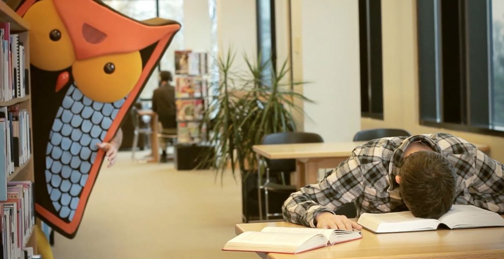
Planning shaped the creative from the start. We set KPIs before producing anything, then built a cadence that introduced the larger idea ahead of the campaign’s Daylight Savings activation, The 25th Hour. Once the campaign went live, we reviewed asset performance daily and adjusted the mix; higher-engagement content earned stronger placement in the automated auctions and pulled cost per impression down.
The campaign reached 90% of students at the targeted schools and delivered more than six million impressions. During the months it ran, sales increased by an average of 17%.
Awake shows how the same brand idea can move from packaging and retail into a campaign built for measurable reach and response.
When Sparkling Ice asked us to create Popwell, we started from zero. The brief: build a prebiotic soda brand that felt fresh, fun, and like a natural extension of the Sparkling Ice family; a complete brand where none existed, from the first strategic decision through finished packaging.
The strategy phase did the foundational work: it named Xennials as the audience and mapped the whitespace the new brand could own; a playful lifestyle expression backed by credible health benefits. Those decisions came before a name or a visual direction existed, and everything after was built on them.
The name came next, blending soda’s lively character with the wellness association of prebiotics, and the identity system carried the same idea forward through flavor names, benefit-led messaging, a joyful logotype, a fruit-forward palette, and custom illustrations that make each flavor easy to recognize on the can. When the brand extended into an Immunity line, the same identity system carried it, with its own flavor illustrations working inside the established language.

Popwell shows how CPG product launch branding works as a sequence: strategy defines the opportunity, naming makes the position memorable, identity and packaging give the new brand a form consumers recognize. The value in the partnership is continuity; each stage building directly on the one before it.
When you hire a CPG branding agency, the first work should build a shared understanding of the brand opportunity. Our engagements start with strategy, before any visual work takes shape; the case studies above show that pattern in practice.
For Awake, the brand story came first and became the source for identity, packaging, digital work, retail materials, and campaign expression. For Popwell, the strategy phase identified the category opening and target audience before the name or visual identity was developed. In both cases, early decisions gave the later creative work a clear point of reference.
From there, the scope can extend through positioning, naming, verbal and visual identity, packaging, retail presence, and campaign work. The exact mix depends on the assignment, but the pattern holds: establish what the brand should mean, then carry that meaning into every expression the consumer encounters.
Clients can expect each part of the work to connect back to that foundation: a name that supports the position, packaging that expresses the identity at retail, campaign work that extends the story to a wider audience. That continuity is what turns separate deliverables into a coherent brand program.
Evaluating a CPG branding agency gets easier once you look closely at the scope and the evidence behind it.
Logo-only scope. A CPG brand has to work across naming, identity, packaging, retail, and communications. A scope centered on a logo leaves the most important consumer-facing applications unresolved.
No shelf evidence. Portfolio images should show how the work performs in real retail environments. Shelf photography, displays, and launched packaging give you a clearer view of the agency’s retail fluency than isolated presentation comps.
Strategy skipped. Creative routes need a defined audience, category opportunity, and brand position behind them. Without that foundation, decisions become preferences: harder to evaluate, harder to hold together across touchpoints.
No campaign follow-through. Launch is the start of the brand’s public life. Ask how the agency can extend the idea into paid media, social content, retail activation, and the next moments of audience growth.
If you’re building a new CPG brand, or preparing an established one for its next stage, let’s talk.
Share » the » story


