
CPG packaging design is the work of building a product’s first impression and carrying that design intent through every interaction that follows. The package carries the brand on the shelf, in the hand, and on the counter at home. It’s the part of the brand consumers actually live with.
At Tether, we approach CPG packaging design as a complete system. Brand expression, structural form, consumer experience, and manufacturing realities all have to work together. The resulting packaging has to perform at retail, hold up through the supply chain, and earn a place in consumers’ daily routines. Because the package isn’t separate from the brand. In many ways, it becomes the brand.
Across categories – food packaging design, beverage, beauty, personal care – the same three principles consistently separate packaging that earns attention from packaging that gets delisted from the shelf.
Packaging that only works for one flavor or one variant rarely scales well. The brand has to remain recognizable across the full portfolio, with a core visual language strong enough to hold together as the lineup expands. The best packaging systems are flexible without losing themselves. Every new SKU should strengthen the overall brand impression rather than dilute it.
Render-first packaging often looks beautiful in isolation and disappears in the real world. Retail environments are crowded, competitive, and visually noisy. That’s the environment packaging has to succeed in. Consumers scan before they read. Recognition happens quickly, often from several feet away and long before someone picks up the product. The shelf is where packaging proves itself.
The silhouette is often the first thing consumers recognize, sometimes before any text or logo registers consciously. Shape carries memory. If the form doesn’t communicate the brand clearly, the label can only do so much to compensate. The strongest packaging systems are built when industrial design and graphic design evolve together from the beginning rather than being solved separately.
Shelf impact is less about being loud than being immediately recognizable. A package has to register quickly, ideally from across the aisle, before conscious decision-making even begins.
Most categories converge on visual conventions over time. Coffee tilts brown and bag-shaped. Cleaning products gravitate toward familiar blues and greens. Cereals crowd shelves with mascots and bright color blocking. The opportunity for a new entrant, or for an established brand ready to evolve, is finding the distinctive space the category has left open.
Color blocking helps. Silhouette matters even more. The shape of the package is often the first thing consumers recognize, from across the aisle, under harsh retail lighting, and surrounded by competing products. When a brand’s SKUs share a strong silhouette, they create a unified visual presence that reads as one brand impression instead of many disconnected products.
The other half of shelf impact is context. Packaging has to be evaluated where it actually lives, under fluorescent lighting, beside competitors, and within the realities of retail merchandising. Studio renders and printed comps only tell part of the story. On the shelf tells the rest.
The structure of the package – the form, the material, the closure, the way it feels in the hand – is inseparable from the brand expression. A premium product in a thin, hollow-feeling container undercuts itself before the consumer reads a word. A practical everyday product in an overly precious structure can create the same disconnect in reverse.
In snack packaging design, the film and format shape how the bag opens, reseals, sounds, and moves in the hand. In beverage, the bottle geometry influences grip, pouring, stacking, transport, and even how the product photographs for marketing. These aren’t secondary decisions. They’re brand decisions.
Industrial design and graphic design have to move together from the beginning. The label is shaped by the form it lives on, and the form has to be designed to carry the graphics naturally. Tether’s packaging work spans graphic, structural, and manufacturing considerations because separating those conversations often produces packaging that feels assembled rather than fully resolved.
In practice, that integration shows up in the trade-offs. A graphic system may want a tall, narrow front panel for hierarchy, while the structural team needs a wider stance for stability in transport. A material that performs best operationally may not support the color saturation the brand requires. A closure that feels intuitive in the hand may add cost the SKU can’t absorb. None of these decisions happen in isolation. The best packaging solutions are resolved together, against the same strategic vision.
The projects below illustrate how these ideas come to life across very different categories and scales. Gatorade demonstrates how structure itself can carry enormous brand equity. Awake shows how strong system thinking creates consistency across an expanding product portfolio.
The Gatorade bottle is one of the most recognizable silhouettes in retail. The shape itself carries brand recognition long before the logo or orange cap consciously registers. Consumers recognize it from across the aisle because the structure was intentionally designed to do brand work, not simply hold liquid.

That’s what the strongest CPG packaging systems achieve. The form carries meaning, and the graphics amplify it. For a product competing in one of the most crowded beverage environments in the world, the silhouette became one of the brand’s most valuable assets. Strip away the graphics entirely and the bottle still unmistakably reads as Gatorade.
See the Gatorade Bottle Design Project
Awake’s packaging system had to solve a different challenge. Rather than carrying a single hero SKU, it needed to create consistency across a growing portfolio of flavors and formats while remaining instantly recognizable as one brand.
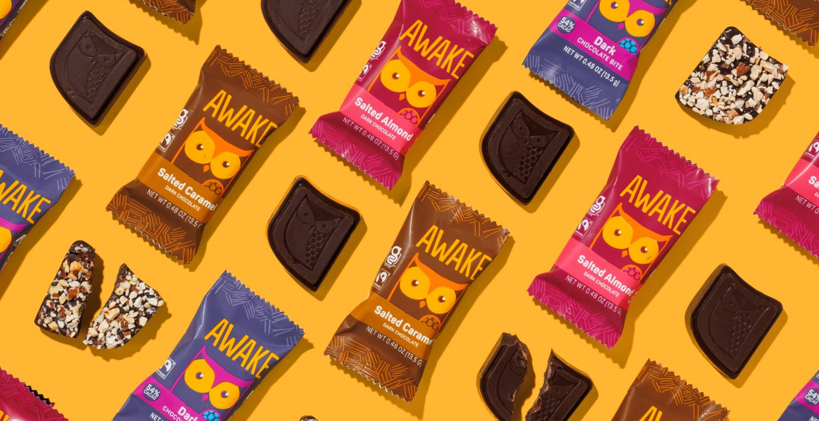
The system solved this through shared architecture: a flexible color logic that differentiates variants without breaking the family, a recognizable mark and character system, and a packaging structure that creates strong retail blocking when merchandised together. Consumers scanning the aisle register the Awake brand before they process any individual flavor.
That’s what successful portfolio packaging looks like in practice, not visual sameness, but a system designed to compound brand recognition over time.
See the Awake Branding and Packaging Project
Explore Our Full CPG Portfolio →
CPG packaging is evolving along two parallel tracks: sustainability and connected experiences.
On sustainability, many of the easy wins of lighter substrates, simplified closures, reduced material usage have already happened. The more meaningful work now lives in mono-material structures, refill systems, improved recyclability, and right-sizing packaging to actual product volume. Each introduces real design constraints and operational trade-offs. That’s why sustainability works best when it’s integrated into the design process from the beginning rather than treated as a final layer.
On connected packaging, QR and NFC technologies can create meaningful experiences in the right categories of authentication, storytelling, sourcing transparency, or deeper brand engagement. In other cases, they add complexity without adding value. The discipline is knowing the difference.
The underlying fundamentals of great packaging design haven’t changed. The package still has to protect the product, communicate the brand clearly, perform at retail, and feel right in the hand. New technologies and sustainable materials are simply new tools for delivering on those fundamentals.
Most of the CPG brands we work with today are balancing sustainability goals alongside shelf performance and brand expression simultaneously. They expect recyclable structures, strong retail presence, and emotionally resonant design systems to coexist. That intersection of strategy, structure, and storytelling is where Tether does its best work.
If you’re launching a new product or evolving an existing portfolio, we’d welcome the conversation.
Share » the » story